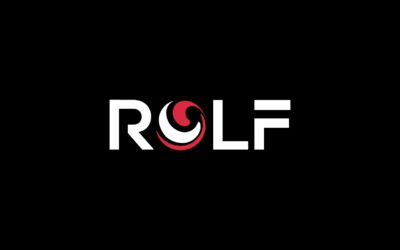
We have updated our logo, and we’re releasing it today!
You’ll see our new look anywhere you find us in public, like our
website,
LinkedIn,
Facebook, and
Twitter; and very soon you’ll see it in all of our materials, as well. We believe the new modern look reflects our focus on the future, including leveraging technology to continue to provide efficient solutions to our clients.

The first change we made to our logo was to incorporate the “ROLF BALL,” as we call it, directly into our name.
Did you know the ROLF BALL, with the swirls of red and black, signifies the fusion of health care (the red swirl) and law (the black swirl)? It’s a symbol of our law firm’s 35 year focus on health care. So when we decided to refresh our look, our first step was to incorporate this symbol of our industry commitment directly into our name.
Next, we picked a new modern font to signify our firm’s ongoing commitment to evolve and drive innovation in our practice. For example, our newly hired Director of Innovation has been driving the development of our own designer software to enhance client service. At ROLF, we view ourselves as not only lawyers, but forward-thinking business people. We wanted our image to reflect that.
We hope you like our new design! Be on the lookout for our new image in the materials we send, as we continue in our commitment to health care and our efforts to drive innovation in the legal practice within it.

 The first change we made to our logo was to incorporate the “ROLF BALL,” as we call it, directly into our name. Did you know the ROLF BALL, with the swirls of red and black, signifies the fusion of health care (the red swirl) and law (the black swirl)? It’s a symbol of our law firm’s 35 year focus on health care. So when we decided to refresh our look, our first step was to incorporate this symbol of our industry commitment directly into our name.
Next, we picked a new modern font to signify our firm’s ongoing commitment to evolve and drive innovation in our practice. For example, our newly hired Director of Innovation has been driving the development of our own designer software to enhance client service. At ROLF, we view ourselves as not only lawyers, but forward-thinking business people. We wanted our image to reflect that.
We hope you like our new design! Be on the lookout for our new image in the materials we send, as we continue in our commitment to health care and our efforts to drive innovation in the legal practice within it.